Did you hear? Somasegar blogged that Team Foundation Server 2013 RC is a go-live release. What does that mean for you and your customers? One word
AWESOMENESS
You might be wonder why I'm so excited about this release. One of the many reasons why I'm so excited about this release is because Work Item Charting which was announced last September and then updated in VSO with the November service updates to support Chart Pinning, and now this feature has made it's way to on premise with TFS 2013 Update 2.
Although this was released for on premise 3 weeks ago in the CTP release it was not a go-live release at that point.
Using Chart Pinning to transform your teams dashboard
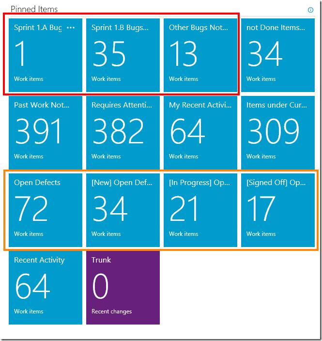
After upgrading to TFS 2013 Update 2 your pinned items would look something like below. This information is very useful for your team as it allows you to easily see bugs from your 2 main product sprints with a 3rd tile telling you other bugs that exist across other products. You are also able to see defects which are the bugs that exist out in the real work in builds that have already been deployed.
Getting any value of this is possible but probably a lot more effort at times with all these numbers staring at you. What if you could represent all 7 of these tiles in a way that is easy to take in with a quick glance and at the same time extend on the information about what the other product sprints are that contain bugs.
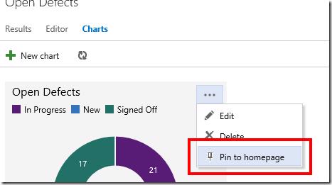
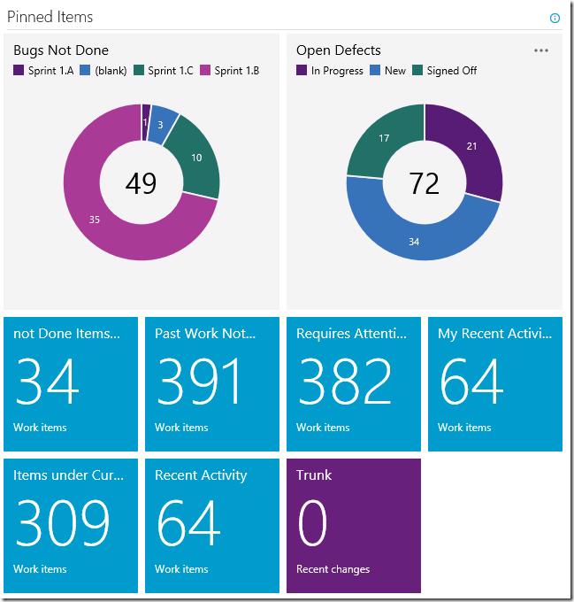
Enter Chart Pinning, transforming these tiles is as easily as creating a chart for the work item query Open Defects and creating a new query that includes all bugs and not just specific products. Next you pin those charts to your dashboard using the Pin to homepage button
and then also unpin the 7 tiles that we are replacing. With the current library being used for the home page grid you will notice that if you place a chart in the second or third column that it leaves empty spaces to it's left if you have regular queries pinned, for that reason I'd recommend moving the pinned charts to the first and second position on your dashboard and you get something like below which is a lot more meaning full the team to glance at as the are passing the home page
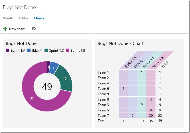
As you can see pinning charts can provide a lot of extra value to your work item data. But let's see how easy it is to dig deeper if you wanted to, we will go through to the Bugs Not Done chart by clicking on the chart (yes the charts work the same way as the tiles do with clicking to go through the query ). We'll add a new chart using the Pivot table chart with a row of our team name and have the columns as the product sprint name and change the Sort to label. Click OK and you have the same chart that you would usually only get by exporting your work item results to excel (pre charts) and then need some complicated manual morphing to see the same thing as below
Hopefully you are preparing to upgrade to TFS 2013 Update 2 and if you weren't before reading this you are now planning to upgrade really soon .


